One of the trends in jewelry retail for the last two years is a considerable reduction of the area of outlets, the most widespread format received the shops up to 40 square meters. It quite logically considering the fact that jewelry became a fashionable accessory now, and the shop to keep up with fashionable novelties has to offer each new season the new range, therefore retailers come to a format:” It is better to surprise the buyer with novelties, than to sell jewelry at a discount”. The store buy jewelry in such quantity that it was possible to sell for a season, and in the following to please clients with novelties. Commodity stocks become smaller, almost all assortment can be seen on counters.
Within this project our task was to develop design of jewelry store with a total area of 20 square meters, accommodate there trading equipment for demonstration of quite wide assortment, to allocate several showcases with the composite layout, to develop a functional cash zone and to make shop memorable.
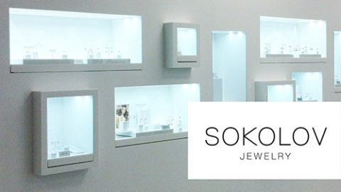
In the area of 20 square meters we have entered 10 near-wall showcases of 1000 mm, 4 hinged showcases of 900 mm, 8 hinged showcases of 500 mm and one showcase at the cash desk. Not each shop of 40 square meters will be able to contain in itself such quantity of trading equipment without damage of an esthetic component. The branded wall is a composite web of 3d-panels, on the wall there is a logo.
As the general lighting was chosen the built-in LED lamp of a neutral spectrum of lighting. The shop is illuminated evenly, that allocates it and does more noticeable.
Project author: Anastasia Beregova.
Photo: Christina Galka.
